This software needs little or no introduction; it’s ubiquitous in every office in the world and it’s in regular use by over a billion people. Two-thirds of all office workers use Excel at least once an hour. Excel users get help from colleagues twice a week. Most Excel users are self-taught and have never received any formal training. One in ten spreadsheets contain a serious error, many of which go unnoticed and some occasionally result in a financial mishap. Errors happen; that’s life. Reducing errors is a worthwhile endeavor and in this blog, we’ll toss out a few ideas on how to make Excel spreadsheets less dangerous.
The problem is Excel itself! Huh? Right. Excel is so feature-rich that anybody can do almost anything with, fonts, colors, backgrounds, and styles. While the availability of tons of options is a very good thing, when such features are used inappropriately, errors may be overlooked, facts may be obscured – both unintentionally and not – and conclusions may be flawed.
It all comes down to the purpose of the spreadsheet and the method of design. Excel spreadsheets can be broken down into two general classes:
Presentation
Data management
What’s the difference? Well, that, dear reader, is the topic of this blog. Because using presentation techniques for data management is a recipe for disaster and the failure of the company and the demise of the industry and the end of civilization. And then there are bad presentations, too. Let’s look closer at these two spreadsheet types.
Presentation. A presentation might be a report prepared for management review, for example a summary of contract modifications with charts and illustrations. Or a spreadsheet that provides an answer for a series of data inputs, for example, government contract clauses that are automatically referenced after inputting contract details. A presentation is typically an on-screen display or single printed page and often decorated with logos, illustrations, and colorful headlines in special sizes and fonts.
Data Management. A series of columns and rows with each cell containing some information or a formula, for example a database of active contracts including vendor name, dates, values, calculations, and evaluation criteria. A data management spreadsheet may have dozens or hundreds of columns and hundreds or thousands of rows. Such spreadsheets are also properly called databases.
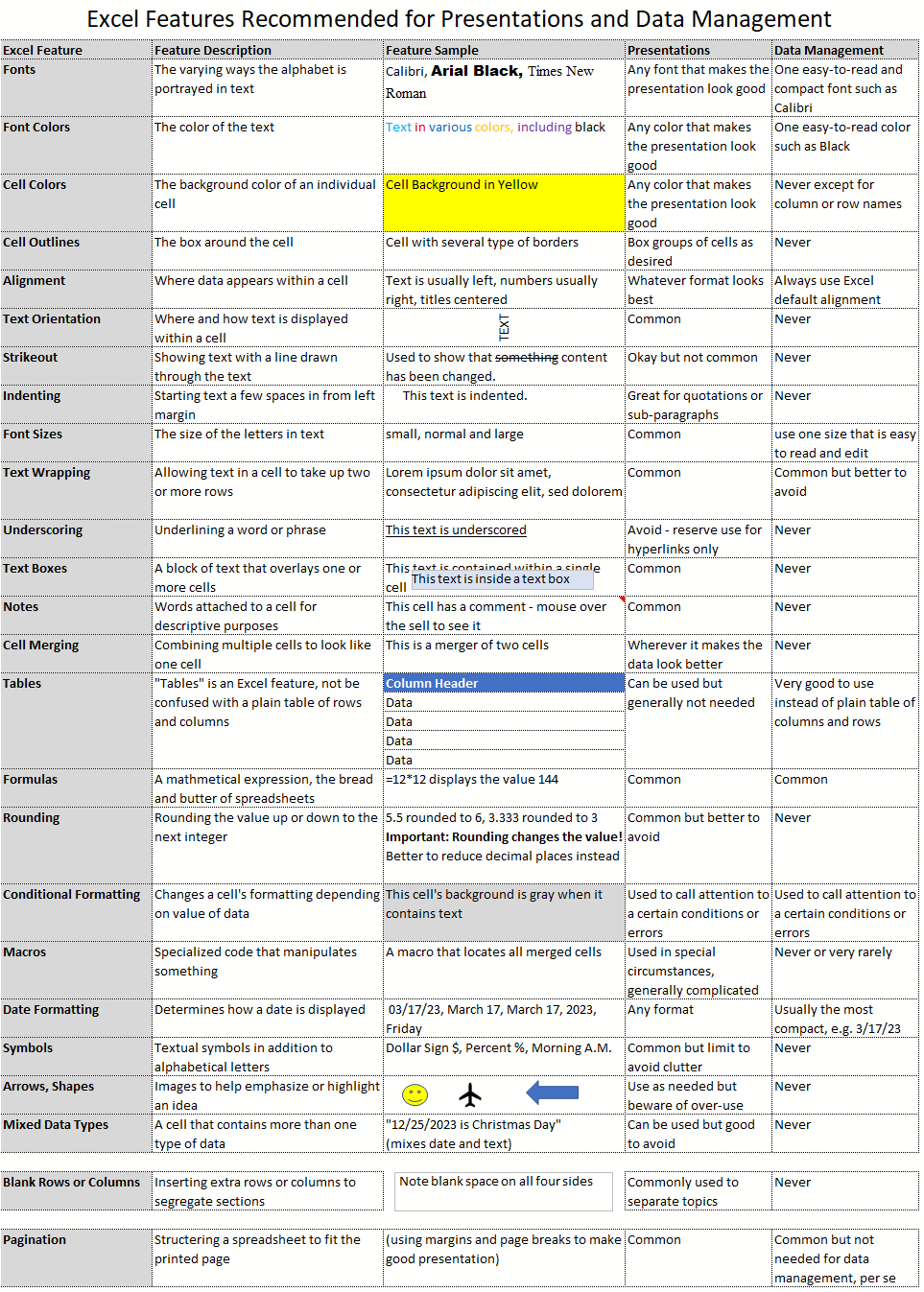
To better appreciate the distinction between the two spreadsheet types, the data management spreadsheet is often the source for the data displayed in a presentation spreadsheet. Such a Workbook could contain one Worksheet for the data and another Worksheet for the presentation, with references to the data Worksheet. Trouble lurks when presentation techniques are applied to data Worksheets. This bad practice is – alarmingly – almost as common as the use of Excel itself. The following table lists several Excel design and formatting features with some tips on when to use them, and not.
Tables is an Excel function that is easily overlooked, misunderstood, or dismissed by those who have been using Excel for years. That’s too bad. This remarkable tool is perfect for data management, and we’ll dig deeper with our next post into how Tables works and why it is perfect for data management.